
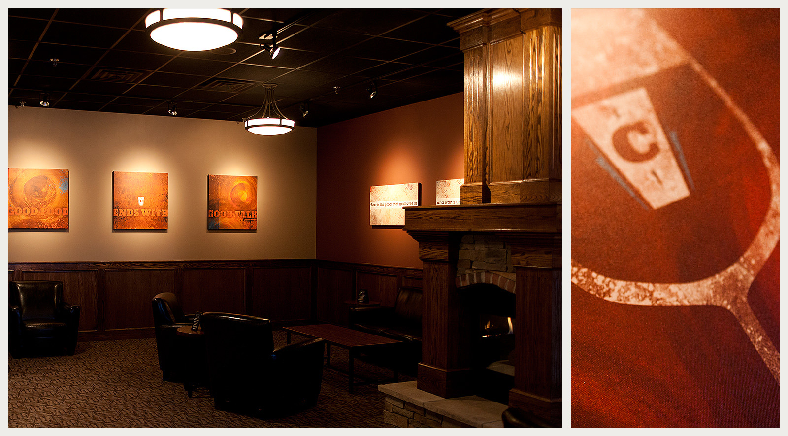
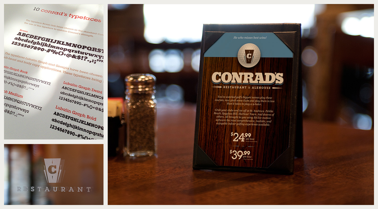
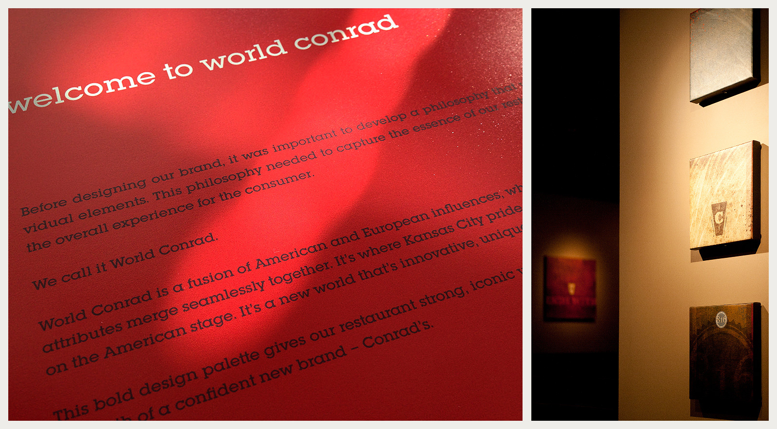
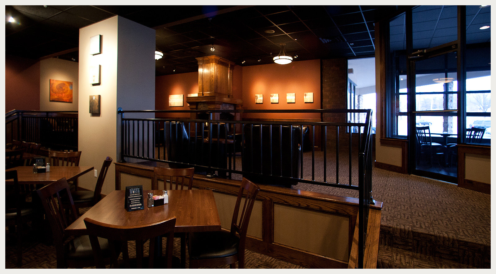
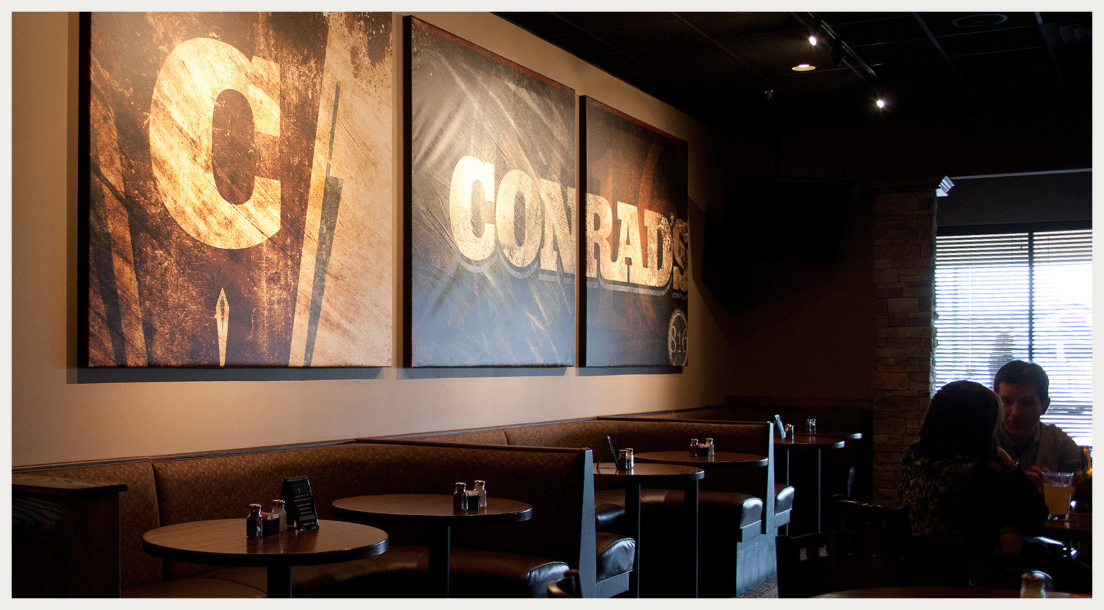
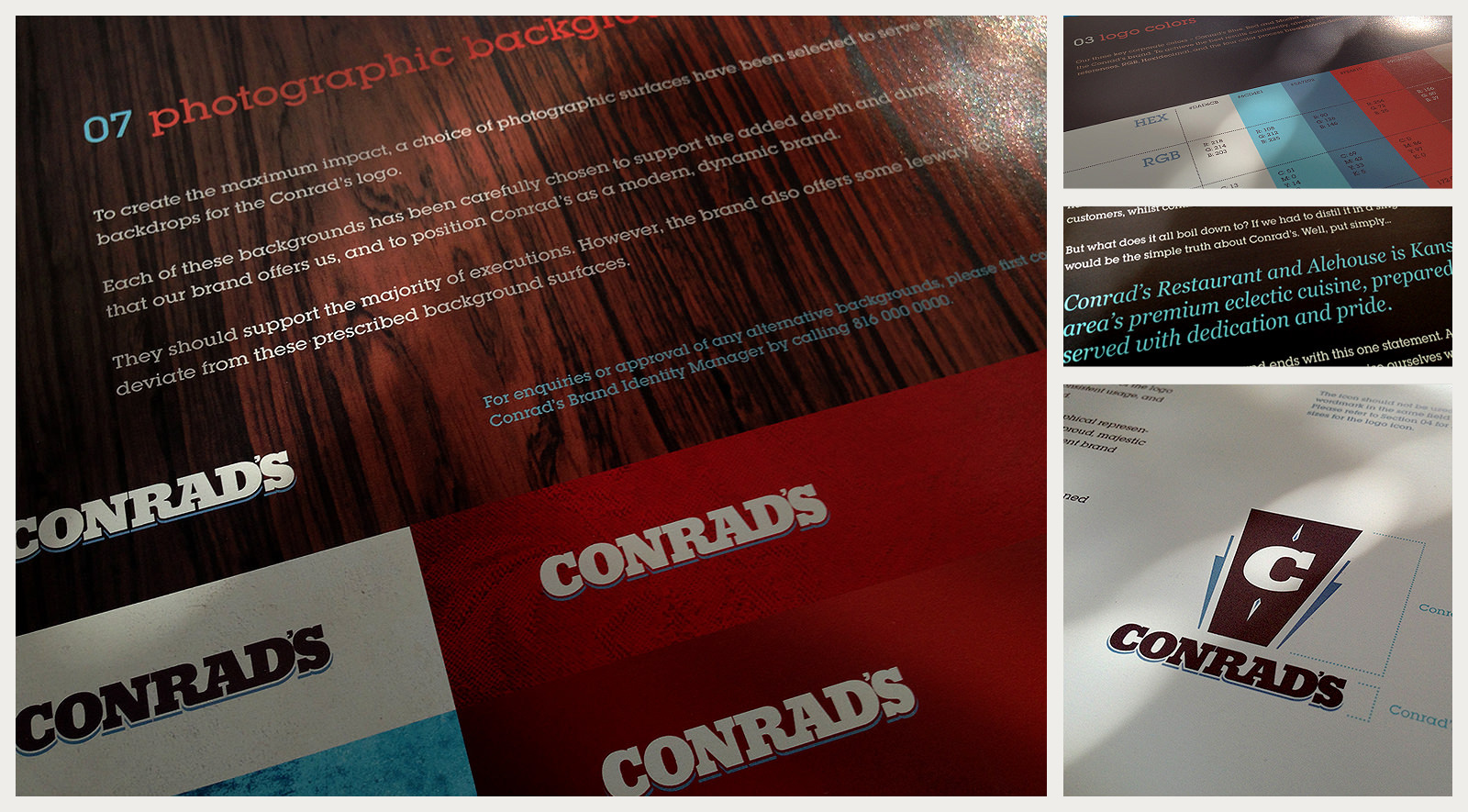
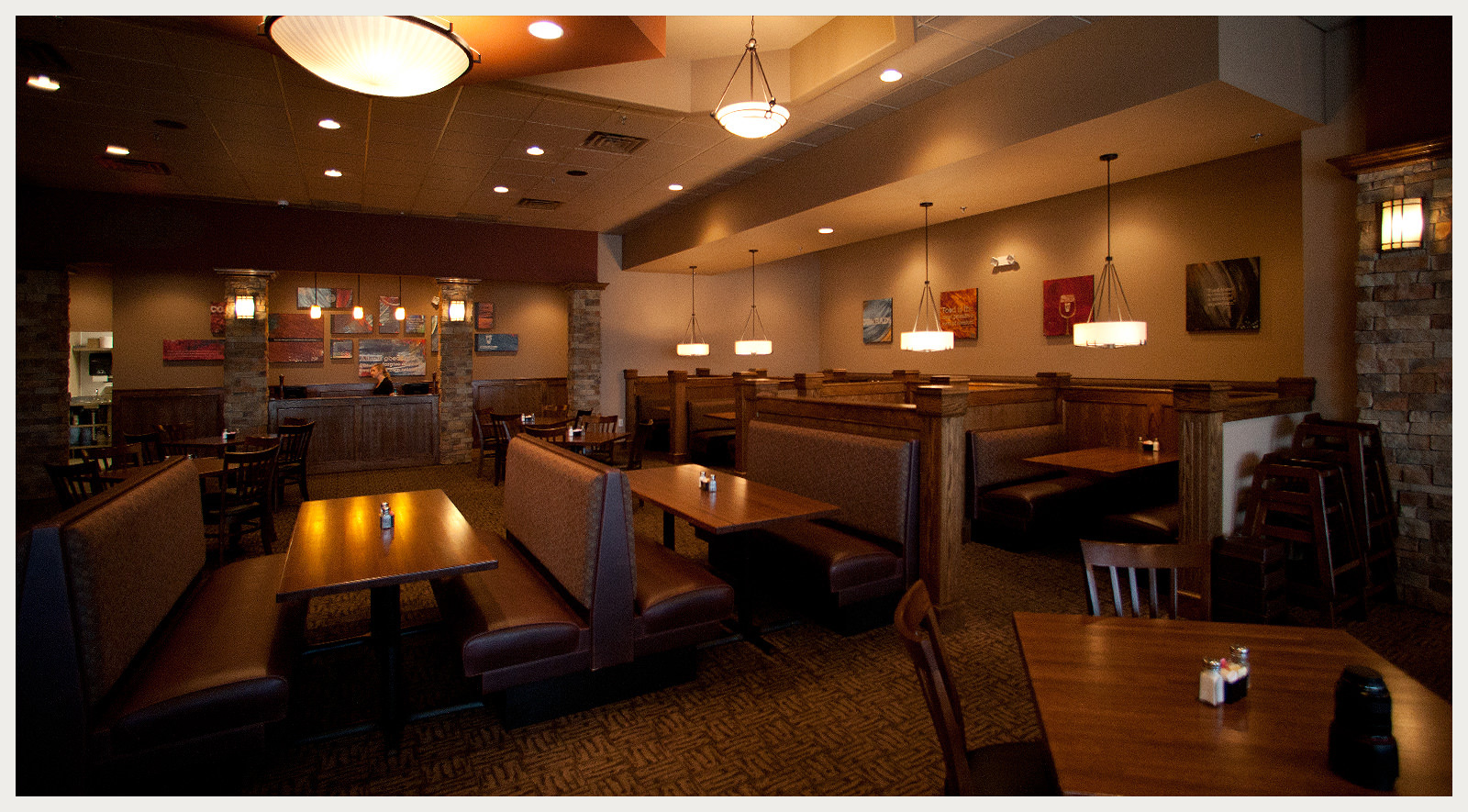
Local Kansas City restaurateur came to me to brand their new flagship restaurant. With being a third generation restaurateur, and bearing the middle name of his grandfather’s business partner, Conrad’s was born. I developed a brand with a nod towards it’s heritage, while still being approachable. Playing the iconic “C” off the subliminal shape of a pint glass declared Conrad’s not only a place for exquisite food, but a perfect place for reuniting with friends and enjoying those great Midwest nights. I worked with the architect and interior designer to develop an inviting color and material palette and developed a seventy plus page brand guide that outlined everything from logo guidelines and approved typefaces, to materials, uniforms and signage.
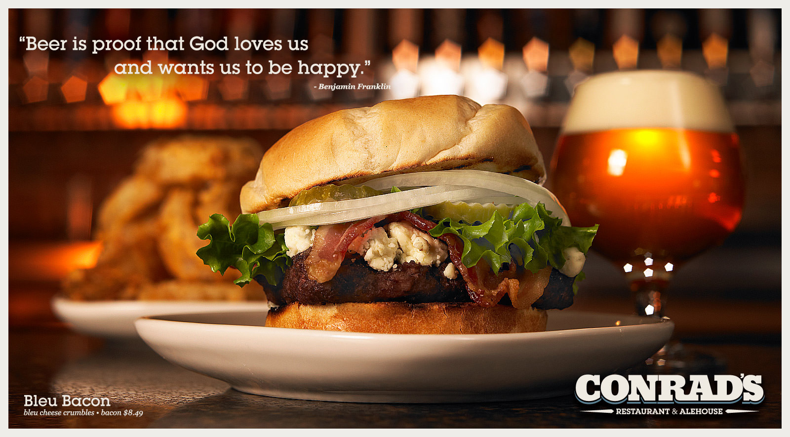
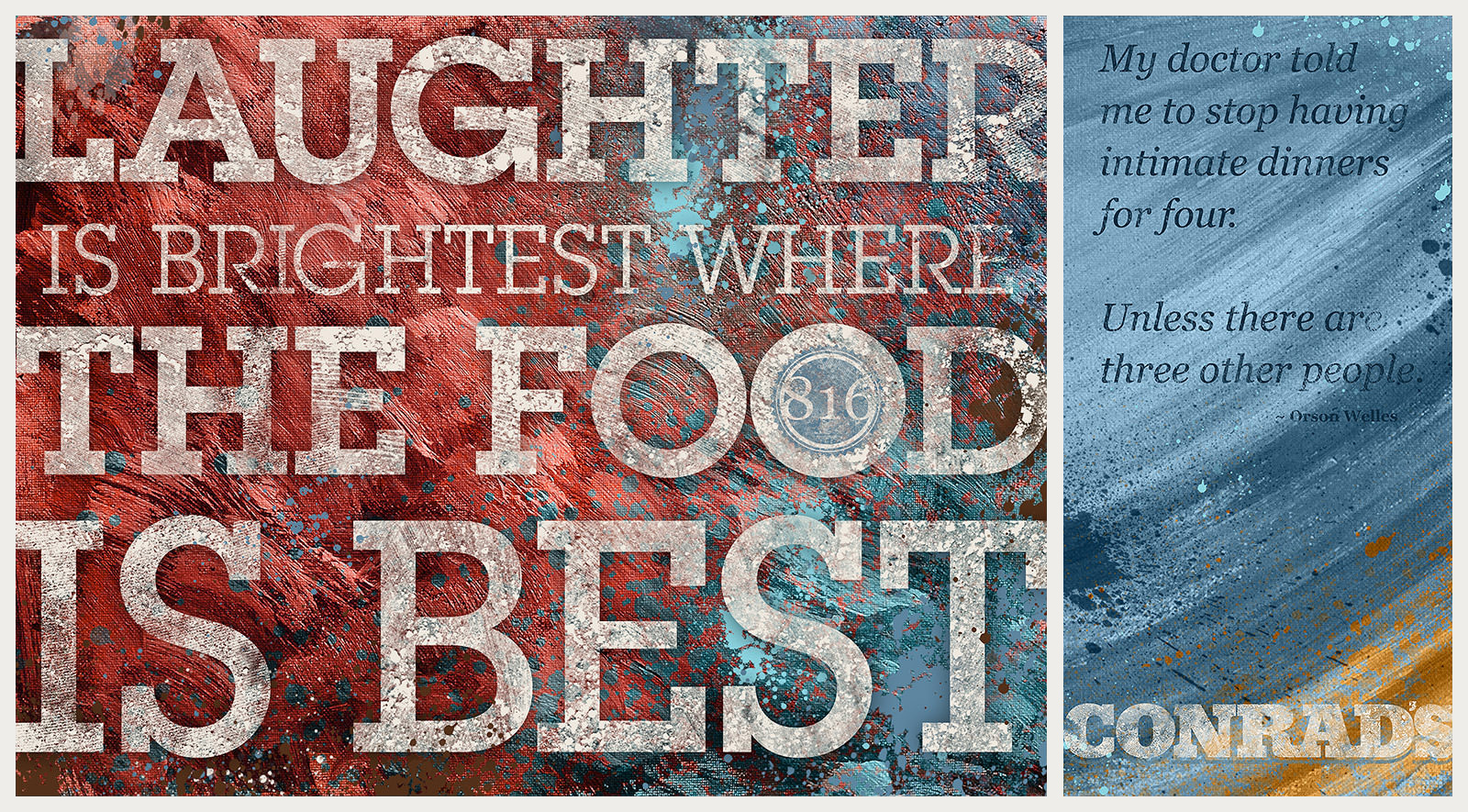
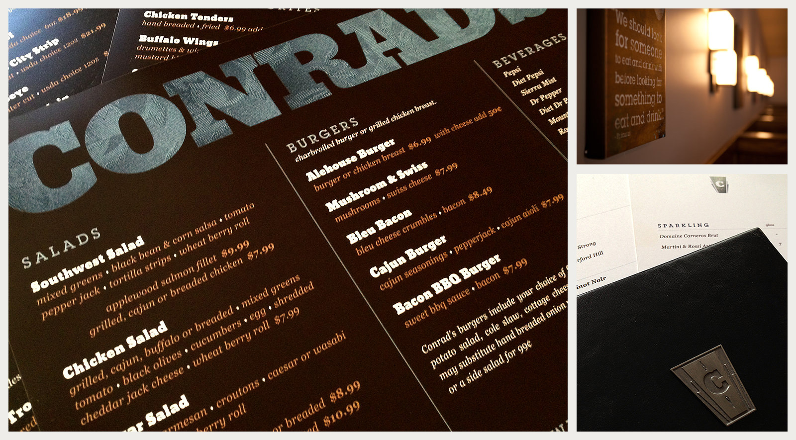
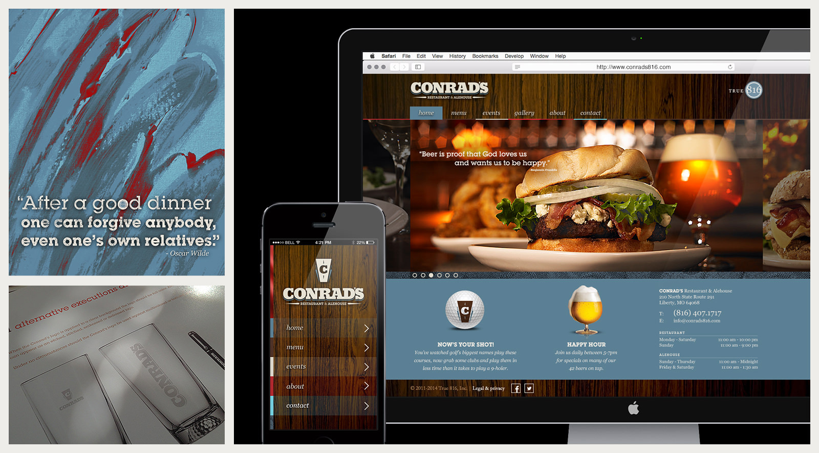
After researching over one-hundred inviting and playful food quotes to adorn both the interior art as well as the website. I began illustrating over fifty custom canvases for aspects of the restaurant. After art directing the photoshoot, which covered one to two items from every section of the menu, I began the task of pulling everything together. I designed the full menu, to-go menu, beer menu, wine menu, and the kid’s menu. I developed all the promotional materials for happy hours and events, even the indoor golf simulator with custom Conrad’s golf balls. I designed aspects for almost every customer touch point for the restaurant. Last to be developed, was the Conrad’s website along with it’s accompanying mobile site. I produced all front-end development and worked directly with the back-end developer to deliver a complete online brand experience.
The campaign was rolled out to the Kansas City market across OOH, Print and a PR newswire blitz.